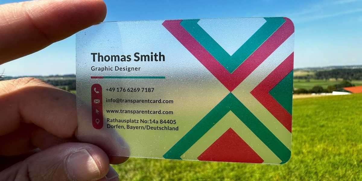
Colors are more than just aesthetic choices; they evoke emotions, convey messages, and influence decision-making. Each color has its own psychological impact, and understanding this can help you design a business card that aligns with your brand identity and resonates with your target audience. In this article, we’ll explore the psychology of color in business card design and provide insights to help you make the right impression.
Why Color Matters in Business Card Design
Colors are powerful communicators. They can influence mood, perception, and behavior in ways that are often subconscious. In the context of business cards, the colors you choose can:
Convey Your Brand Personality: Colors can reflect whether your brand is professional, creative, modern, or traditional.
Evoke Emotional Responses: Different colors trigger different emotions, from trust and calmness to excitement and urgency.
Differentiate Your Brand: Strategic use of color can make your business card stand out in a stack of plain white cards.
Enhance Readability: The right color combinations ensure your contact information is legible and easy to read.
The Psychology of Specific Colors
1. Blue: Trust and Dependability
Blue is one of the most popular colors in business branding. It conveys trust, professionalism, and reliability. Companies in industries like finance, healthcare, and technology often use blue to reassure clients of their stability and competence.
Use Case: A financial advisor’s business card might feature a deep navy background with white text, emphasizing trust and authority.
Psychological Impact: Calmness, security, and professionalism.
2. Red: Passion and Energy
Red is bold, attention-grabbing, and energetic. It’s often used to convey passion, urgency, or excitement. While red can be powerful, it’s important to use it sparingly to avoid overwhelming the design.
Use Case: A fitness trainer’s business card might use red accents to convey energy and motivation.
Psychological Impact: Action, intensity, and excitement.
3. Green: Growth and Harmony
Green is associated with nature, growth, and health. It’s a versatile color that can convey eco-friendliness or financial prosperity, depending on the shade and context.
Use Case: A landscaping business could use earthy green tones to highlight its connection to nature.
Psychological Impact: Balance, renewal, and sustainability.
4. Yellow: Optimism and Creativity
Yellow is cheerful and optimistic, often used to convey happiness and creativity. However, it should be balanced with other colors to avoid straining the eyes.
Use Case: A graphic designer’s card might use bright yellow accents to suggest creativity and innovation.
Psychological Impact: Warmth, positivity, and energy.
5. Black: Sophistication and Elegance
Black is timeless, sleek, and professional. It’s often used in minimalist designs to convey luxury and sophistication.
Use Case: A high-end fashion brand’s business card might feature a black background with gold foil text.
Psychological Impact: Power, elegance, and authority.
6. White: Simplicity and Clarity
White represents cleanliness, simplicity, and modernity. It’s often used as a background color to create a clean and professional look.
Use Case: A tech startup might use a white background with bold typography to convey innovation and simplicity.
Psychological Impact: Purity, simplicity, and openness.
7. Purple: Creativity and Luxury
Purple is often associated with royalty, luxury, and creativity. It’s a great choice for brands that want to stand out while maintaining a sense of elegance.
Use Case: A cosmetic brand’s business card might use soft lavender tones to suggest luxury and femininity.
Psychological Impact: Imagination, sophistication, and exclusivity.
8. Orange: Enthusiasm and Warmth
Orange combines the energy of red and the friendliness of yellow. It’s an inviting and energetic color often used by brands that want to appear approachable and fun.
Use Case: A marketing consultant might use orange accents to suggest creativity and enthusiasm.
Psychological Impact: Excitement, friendliness, and vibrancy.
9. Pink: Compassion and Femininity
Pink is often used to convey softness, compassion, and femininity. Depending on the shade, it can be playful or sophisticated.
Use Case: A wedding planner’s business card might feature blush pink tones to evoke romance and elegance.
Psychological Impact: Warmth, nurturing, and elegance.
Combining Colors for Maximum Impact
Using multiple colors on a business card can create a dynamic and engaging design, but it’s essential to balance them effectively. Here are some tips for combining colors:
Choose a Dominant Color: Select one primary color that represents your brand’s personality.
Use Complementary Colors: Pair colors that enhance each other, such as blue and orange or purple and yellow.
Consider Neutral Tones: Use black, white, or gray to balance bold colors and maintain readability.
Test for Contrast: Ensure text and important elements stand out against the background for maximum legibility.
Cultural Considerations in Color Psychology
Color meanings can vary across cultures, so it’s important to consider your target audience. For example:
Red is associated with luck and prosperity in China but can signify danger in Western cultures.
White symbolizes purity in some cultures but mourning in others.
Understanding your audience’s cultural preferences can help you avoid unintentional misinterpretations.
Practical Tips for Choosing Colors
Align with Your Brand Colors: Use the colors from your logo and branding guidelines to create consistency.
Consider Your Industry: Certain colors are more common in specific industries. For example, blue is prevalent in finance, while green is popular in health and wellness.
Test Your Design: Print samples of your business card to see how the colors look in real life. Digital screens can sometimes distort color perception.
Seek Professional Help: If you’re unsure, consult a graphic designer to create a cohesive and impactful design.
The Role of Finishing Touches
Beyond color, the finish of your business card can also enhance its impact. Options like foil stamping, embossing, and matte or glossy finishes can elevate the overall look and feel. For example, a glossy finish can make bright colors pop, while a matte finish gives a sophisticated and understated vibe.
Conclusion
The psychology of color in business card design is a critical factor in making the right impression. By understanding the emotional and cultural connotations of different colors, you can create a business card that not only looks appealing but also communicates your brand’s values and personality effectively. Remember, your business card is a reflection of your brand, and every design choice—from color to typography—should work harmoniously to leave a lasting impression.
Take the time to choose colors that align with your brand’s identity and message, and you’ll be well on your way to creating a business card that stands out in a crowded marketplace.


